Release
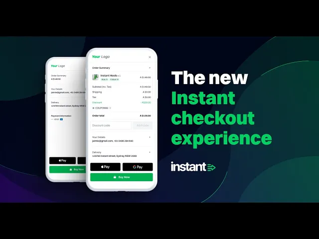
The new Instant Checkout Experience
The new Instant Checkout Experience
Introducing our revamped "first-time" shopper experience for online checkouts.
Introducing our revamped "first-time" shopper experience for online checkouts.

In today’s fast-paced world, people expect quick and easy experiences. This is especially true when it comes to online shopping. If the checkout process is confusing or takes too long, customers are likely to abandon their purchases and look elsewhere, with research showing that up to 70% of all online shoppers abandon their purchase. That’s why it’s critical to have a strong user experience (UX) for online checkouts. Instant’s Checkout is built with this in mind, and today we have released a large revamp of our “first-time” shopper experience to adhere to all the best practices and standards that users expect from a modern checkout. Specifically, we have targeted 5 key areas:
Complexity
Trust
Mobile
Convenience
Choice
Complexity - One-page checkout
According to the Baymard Institute, one of the main reasons users abandon the checkout process is due to complexity and lacking ease-of-use. A primary indicator of complexity is the number of actions a user must take to complete their purchase, such as filling out fields and navigating form sections. In fact, there is a clear correlation between the number of fields in a checkout and its conversion performance.

baymard.com/research 60 Top E-Commerce Sites in 2021
Many have turned to one-page checkouts as a means to address this, however there are no clear indications that the number of pages contributes to increased conversion. With this understanding we designed our new checkout experience with one core focus:
Reduced visual complexity and the intimidation factor of large forms, while still providing the user a clear, guided journey through the checkout process.
In other words, we wanted to combine the benefits of a multi-page checkout with those of a one-page checkout. We then simplified this into two key requirements:
Users should have a clear indication of how many steps are involved to complete a purchase, which minimises the time spent in the checkout.
Users don't need to see every available input at each stage of the journey, instead, fields can be provided contextually to reduce visual load.
In the end, we came up with a "collapsible-section" approach. This approach smartly displays only the required part of the UI at each stage of the checkout process, with a clear indication of the ongoing input, but without the visual verbosity.

Through user testing we have seen significantly improved checkout performance in 3 key areas:
Increased speed to complete the checkout form
Increased conversion of the form, with reduced abandonment
Increased clarity, indicated by less interactions with filled sections
Trust - Merchant Theming
Whilst having our updated Checkout experience is a big improvement just in itself, there is another key performance area for many checkouts that is much trickier to address. This area is “Trust”. According to the Baymard Institute, https://baymard.com/lists/cart-abandonment-rate, trust is a determining factor in 19% of checkout abandonments.

baymard.com/research 2,219 responses
Designing an interface that users trust involves multiple considerations, outlined in this article. However, the common thread throughout is branding. How can a site establish a clear and consistent voice that resonates throughout the entire purchasing journey? At Instant, we believe that the time a merchant invests in their brand and customers is of paramount importance. In fact, leveraging this investment is the primary means of ensuring that customers maintain a degree of trust and confidence at the checkout. So how do we leverage this existing trust?
Alongside our new Checkout we have considerably revamped our personalisation features. Now we can give each checkout a holistic “look and feel”, that is consistent with our customers store. This sits alongside existing features such as logo positioning and our Checkout button, which appears on product pages.

Mobile - Optimisation
“Mobile first” is a phrase that you hear a lot, and it’s especially relevant in e-commerce, where almost 80% of all transactions happen on a mobile device. At Instant, this trend holds firm, with more than 80% of our total checkout traffic coming from mobile. For this reason, we have made mobile optimisation a huge priority. We have addressed this across a number of key areas:
Clear and simple navigation
Increasing clickable areas while reducing white-space
Contextual and intuitive keyboards
Concise and readable text
By implementing these optimisations, mobile users will have a more seamless and enjoyable checkout experience, which can ultimately lead to higher conversion rates.
Convenience - Account persistence
Account creation is a significant point of friction in user journeys across the entire web, not just e-commerce products. When considering whether to complete a purchase though, it can be a much larger hurdle for online shoppers. On average, 25% of shoppers abandon their checkout because they are required to create an account. The reason for this is two-fold:
Sign up requires an additional step to complete a purchase
Sign in creates additional friction to recall and input account information
At Instant, we believe that it’s possible to have all the benefits of a user account without the hassle. In fact, it’s at the heart of our design philosophy to ensure a frictionless user experience. We accomplish this very simply:
A buyer encountering Instant for the first time inputs their details through our streamlined Checkout and agrees to have this data saved on their device.
A returning user has their data pre-filled for an “Instant” Checkout experience.
This user journey results in significantly higher conversion then typical checkouts, without requiring any explicit sign up and is highly optimised for repeat shoppers.
Choice - Apple and Google Pay
Choice is a critical factor for consumers when it comes to online shopping, and this is particularly true at the checkout stage. Consumers expect to have a variety of payment options available to them, with data showing 11% of abandoned checkouts are due to not having enough payment options. To address this, we have implemented Apple Pay and Google Pay in addition to credit card transactions.

These options also sit nicely with our core design paradigm of providing a streamlined, one step experience to consumers. These additional options also drastically increase conversions as well. Research shows that Apple Pay can increase checkout conversion by 20%.
Single-step checkout
So we have a means to quickly gather customer information to complete a purchase, and we are able to get them through that with confidence… but how do we take checkout conversion to the next level? The answer is Instant’s single-step checkout! To find out more, take a look at https://www.instant.one/checkout.
If you would like a free demo or to contact our team, please reach out here.
In today’s fast-paced world, people expect quick and easy experiences. This is especially true when it comes to online shopping. If the checkout process is confusing or takes too long, customers are likely to abandon their purchases and look elsewhere, with research showing that up to 70% of all online shoppers abandon their purchase. That’s why it’s critical to have a strong user experience (UX) for online checkouts. Instant’s Checkout is built with this in mind, and today we have released a large revamp of our “first-time” shopper experience to adhere to all the best practices and standards that users expect from a modern checkout. Specifically, we have targeted 5 key areas:
Complexity
Trust
Mobile
Convenience
Choice
Complexity - One-page checkout
According to the Baymard Institute, one of the main reasons users abandon the checkout process is due to complexity and lacking ease-of-use. A primary indicator of complexity is the number of actions a user must take to complete their purchase, such as filling out fields and navigating form sections. In fact, there is a clear correlation between the number of fields in a checkout and its conversion performance.
baymard.com/research 60 Top E-Commerce Sites in 2021
Many have turned to one-page checkouts as a means to address this, however there are no clear indications that the number of pages contributes to increased conversion. With this understanding we designed our new checkout experience with one core focus:
Reduced visual complexity and the intimidation factor of large forms, while still providing the user a clear, guided journey through the checkout process.
In other words, we wanted to combine the benefits of a multi-page checkout with those of a one-page checkout. We then simplified this into two key requirements:
Users should have a clear indication of how many steps are involved to complete a purchase, which minimises the time spent in the checkout.
Users don't need to see every available input at each stage of the journey, instead, fields can be provided contextually to reduce visual load.
In the end, we came up with a "collapsible-section" approach. This approach smartly displays only the required part of the UI at each stage of the checkout process, with a clear indication of the ongoing input, but without the visual verbosity.
Through user testing we have seen significantly improved checkout performance in 3 key areas:
Increased speed to complete the checkout form
Increased conversion of the form, with reduced abandonment
Increased clarity, indicated by less interactions with filled sections
Trust - Merchant Theming
Whilst having our updated Checkout experience is a big improvement just in itself, there is another key performance area for many checkouts that is much trickier to address. This area is “Trust”. According to the Baymard Institute, https://baymard.com/lists/cart-abandonment-rate, trust is a determining factor in 19% of checkout abandonments.
baymard.com/research 2,219 responses
Designing an interface that users trust involves multiple considerations, outlined in this article. However, the common thread throughout is branding. How can a site establish a clear and consistent voice that resonates throughout the entire purchasing journey? At Instant, we believe that the time a merchant invests in their brand and customers is of paramount importance. In fact, leveraging this investment is the primary means of ensuring that customers maintain a degree of trust and confidence at the checkout. So how do we leverage this existing trust?
Alongside our new Checkout we have considerably revamped our personalisation features. Now we can give each checkout a holistic “look and feel”, that is consistent with our customers store. This sits alongside existing features such as logo positioning and our Checkout button, which appears on product pages.
Mobile - Optimisation
“Mobile first” is a phrase that you hear a lot, and it’s especially relevant in e-commerce, where almost 80% of all transactions happen on a mobile device. At Instant, this trend holds firm, with more than 80% of our total checkout traffic coming from mobile. For this reason, we have made mobile optimisation a huge priority. We have addressed this across a number of key areas:
Clear and simple navigation
Increasing clickable areas while reducing white-space
Contextual and intuitive keyboards
Concise and readable text
By implementing these optimisations, mobile users will have a more seamless and enjoyable checkout experience, which can ultimately lead to higher conversion rates.
Convenience - Account persistence
Account creation is a significant point of friction in user journeys across the entire web, not just e-commerce products. When considering whether to complete a purchase though, it can be a much larger hurdle for online shoppers. On average, 25% of shoppers abandon their checkout because they are required to create an account. The reason for this is two-fold:
Sign up requires an additional step to complete a purchase
Sign in creates additional friction to recall and input account information
At Instant, we believe that it’s possible to have all the benefits of a user account without the hassle. In fact, it’s at the heart of our design philosophy to ensure a frictionless user experience. We accomplish this very simply:
A buyer encountering Instant for the first time inputs their details through our streamlined Checkout and agrees to have this data saved on their device.
A returning user has their data pre-filled for an “Instant” Checkout experience.
This user journey results in significantly higher conversion then typical checkouts, without requiring any explicit sign up and is highly optimised for repeat shoppers.
Choice - Apple and Google Pay
Choice is a critical factor for consumers when it comes to online shopping, and this is particularly true at the checkout stage. Consumers expect to have a variety of payment options available to them, with data showing 11% of abandoned checkouts are due to not having enough payment options. To address this, we have implemented Apple Pay and Google Pay in addition to credit card transactions.
These options also sit nicely with our core design paradigm of providing a streamlined, one step experience to consumers. These additional options also drastically increase conversions as well. Research shows that Apple Pay can increase checkout conversion by 20%.
Single-step checkout
So we have a means to quickly gather customer information to complete a purchase, and we are able to get them through that with confidence… but how do we take checkout conversion to the next level? The answer is Instant’s single-step checkout! To find out more, take a look at https://www.instant.one/checkout.
If you would like a free demo or to contact our team, please reach out here.


Join 1,500+ leading brands using
Instant as their #1 revenue driver.
Instant as their #1 revenue driver.
Start using the AI that runs your email and SMS marketing for you.
Join 1,500+ leading brands using
Instant as their #1 revenue driver.
Instant as their #1 revenue driver.
Start using the AI that runs your email and SMS marketing for you.
Join 1,500+ brands using
Instant as their
#1 revenue driver.
Instant as their
#1 revenue driver.
Start using the AI that runs your email and SMS marketing for you.