
Choose a style for each brand kit button
Merchants can now make each brand kit button filled, outlined, or an underlined text link, and every email follows it.
- Brands with a minimal look can now use styles such as underlined links in place of boxed buttons.
- Now they set it one time in the brand kit, and every email follows it, also emails that AI makes.
- Padding on every CTA style lets merchants control the space around a link.
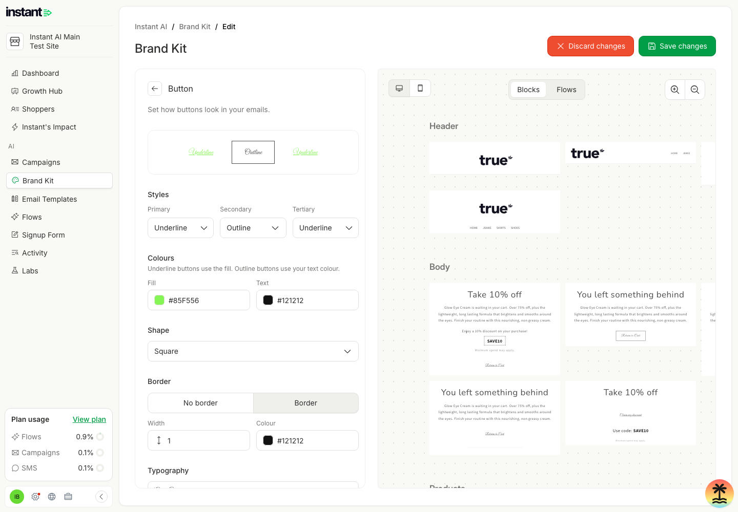
- Go to Instant AI > Brand Kit, click Edit branding, then click the edit pencil next to Button. The new Styles group has three buttons: Primary, Secondary, and Tertiary.
- For each one, choose Filled, Outline, or Underline. By default, Primary is Filled, Secondary is Outline, and Tertiary is Underline.
- Underline shows the button as an underlined text link in your button fill colour. Outline uses your button text colour.
- The preview updates at once. Click Save changes, and all your flows and campaigns use the new styles.
- In the email editor, a CTA set to Filled uses the Primary style, Outline uses Secondary, and Underline uses Tertiary. Custom keeps its own settings. Product buttons use the Primary style.
- The Button card at the top shows your three buttons as they look in your emails, labelled by style.
- Shape (Square, Rounded, Round, Custom) is now a dropdown, for buttons and for images.
- In the email editor, a CTA button now shows the Padding setting for every style, not only Custom.